If you read here at all, you know that I promote simple, clear and easy to read resumes, that email effectively, tell the UPM exactly what job you want, and facilitate easy customization. You also know that I follow ATS compliance practices to help you get your resume through the algorithmic gatekeepers when you apply to advertised jobs. This is why I eschew templates, especially those made with tables, and always start from scratch with a straightforward word document that is easily converted to a PDF for direct emailing.
Having said all of that, it is time to address the increasing frequency of pretty “brochure style” resumes with color and images that I see and that I am sometimes asked for specifically.
Just as there is a place in regular business, sales, office or customer service job hunting for a Functional Resume, to go along with your ATS Optimized Chronological Resume, there is a place for a fancy brochure in your job application arsenal. The point will be how and where you use them.
The same principles that inform all my resume recommendations apply:
- Your resume is not about you – it is about the hirer.
- A confused buyer always says “no”.
- The function of a resume is to get you an interview – you get the job.
- Make it easy for them to call you with clear and visible contact information.
- For film and TV resumes, the job title in your credits indicate the skills.
Here is where you should NOT use these documents.
- Applying for advertised jobs with companies that are likely to use an ATS – that is they have a human resources department, they are a major chain, or a multinational corporation like any studio or network today. (Exception, as always, Google.) These are definitely NOT ATS optimized. They will not stay pretty looking, and they will turn your information into nonsense when the ATS tries to parse them. Plus you can’t really keyword load effectively.
- When you are following up on cold call for a crew position and they want to see your resume. Why? Because by their very nature, the amount of information on these brochures is limited. There is a lot of open space and color – and may even be images. You may not be able to include all your credits effectively, and being graphics based, tweaking them is a PITA, compared to your credits-based direct submission Word document. Additionally, they take longer to load when clicked on. You want to help the hirer see that you are qualified immediately.
- When you are very early in your career and still have mostly PA credits. These brochure-style summaries lend themselves to someone with a higher level of job title or hyphenate like “Director/Producer”, because of the “see at a glance” aspect. And frankly, don’t be pretentious.
When ARE these useful?
- When you are putting together a sales or marketing package for funding sourcing or distribution purposes and want to show off your crew members.
- When you are putting together an electronic press kit (EPK) and they only need a summary of your credits and accomplishments.
- When you want a really nice visual resume on your website, that might be downloadable, or to add to LinkedIn in the media section – just to have something razzle dazzle.
- Sometimes, when you are following up on a networking meeting, and you want to remind people of who you are with your picture. These resumes typically have a headshot – which is another reason not to use them for listed job applications or online job application forms. Make sure you still look like your headshot.
The main point is that these are a SUMMARY. They lose all effectiveness as a visual attention grabber if you attempt to add too much writing to them.
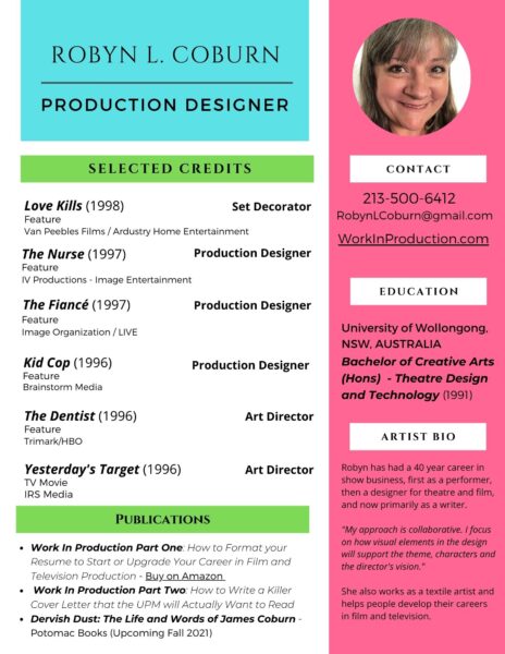
Here’s one that I put together using Canva.com (my favorite). I adapted one of their resume templates (sigh.)

I think you can download it as a PDF by clicking the button below. I made a second page with a small selection of images from my portfolio.
I guess my main point is – I have so many more credits. I only chose the movies that have the highest profiles per the directors or being seen on cable. I probably don’t need to make my education so prominent for most purposes, so I will be adjusting that. But you get the idea.
Shortly I will be creating a new writer’s one pager for myself using a similar visual layout. I’ll post it when I do. I will be adding a principles and best practices PDF, and if you think this would be a valuable service for clients let me know, and I will add it to my selection for next year.

